Monday, 29 March 2010

Draft Designs for Magazine

This is the draft front cover page for my magazine:

How I will improve my cover:

  • Feather and brush the uneven surfaces to give it a 'glossy' magazine look
  • Fix the person's leg; it is cut off and looks unprofessional
  • Fill in the blank space underneath 'Razorlight' .

This is the draft contents page for my magazine:
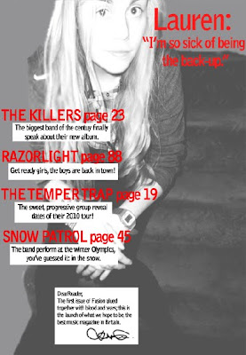

How I will improve my contents page:

  • Add some images to accompany the feature article contents
  • Add a page number to direct to the main 'Lauren' article.
  • Include access to other factions of the magazine, i.e. 'upcoming events'

4-Page Magazine Article

With the sudden downfall of ‘In Before You’, a band who have scarred the country with it’s disastrous songs, Lauren Zane thought this was the end of her career. But boy, was she wrong.

As a back-up singer, she did not have a major role in this so called ‘best band of 2007’ (an award granted by NME awards); it was something that she hated doing. But a catastrophic turn by the band from ‘electric’ to ‘punk’ music in 2009, turned the public against the band, who have now shamefully disappeared out of the music industry. Lauren flinches at the memory of even being the back-up of such a terrible band.

‘I used to hate being the back-up, clicking my fingers and shuffling my feet, but once things started going wrong, it made it easy to detach myself from it all.’ She was spotted by Columbian Records in early 2009, who have helped her change her appearance to alienate her from the emo/punk image that ‘In Before You’ had previously created. She shivers at a photo of her back then, and is more than willing to talk about her future rather than her past.

Today, Lauren sits comfortably on a couch in the studio, in casual high-street clothes, chatting and laughing to the people around her. Who would have thought this back-up singer would be at the top of the music world?

‘I was in numb shock when I was offered a contract with Columbian Records! I had been working on a few songs myself, and with the help of some of the writers I had a complete album.’ She still seems dumbstruck at this prospect. Columbian Records, who have also launched the albums of Kings of Leon and Kesha, have influenced Lauren’s debut album. Released only 8 months ago, it has won a Brit award and an NME music award. ‘I just couldn’t believe it when they said my name up there. I had practiced speeches since I was five in front of mirrors, but I totally f***** it up on the night with my stutters, it was so shocking!’

This nineteen year-old star has smashed the tables with her single ‘Kiss My Brain’, that has won an MTV video music award, a ‘Q’ award and reached out as far as a Grammy. Lauren’s shelves must be loaded with trophies and medals, and all from a solo career over the 12 months?

The British public have welcomed Lauren with open arms and nominated her as best female artist at the Brit awards. ‘I wasn’t expecting for the public to like me at all, I don’t even like myself!’ She may not expect people to like her, but she can’t deny people loving her music.

As a child, she put her heart into music and drama lessons, not concerned with future financial issues, only following her passion of singing. Gaining a spot in ‘In Before You’ thanks to her college bestfriend Frank Stanley (who also happenned to be the lead singer) was what she believed to be, the start of a successful music career. But with rivalry from The Temper Trap and Kings of Leon, a small band with unsuccessful punk songs that wasonly famous for a short period of time, is not destined to go far.

Being a professional singer - if the awards don’t speak for themselves, let Lauren's grade 8 singing diploma and life-long experience prove otherwise. ‘I have loved singing since I was in the womb, I swear.’ Lauren carries a warm aura around her, captivating not only the staff here, but the public too. If her talent isn’t convincing enough, her great social life, volunteer work and hilarious persona are bound to change that. Her appearance on ‘Mock the Week’ has impressed the country, and she has even been asked to appear as a regular on the show. ‘That has definitely been the highlight of 2010 so far, it’s one of my favourite TV programmes!’

When asked about the future, Lauren proudly lists a bunch of gig performances, TV appearances and ends by revealing her live tour that will launch in October 2010. ‘It’s all happening so fast, everything and everyone seems to be moving around me and I’m just here with my tea. I mean, if you told me a year ago this was going to happen, I would have laughed in your face.’

2009; a turning point for Lauren Zane. The destruction of the failing band ‘In Before You’ and unexpected launch of a fantastic solo career.


Friday, 26 March 2010

Edited Photos

This is the edited photo for the front cover of my magazine:

Edited image for my contents page:

Thursday, 25 March 2010

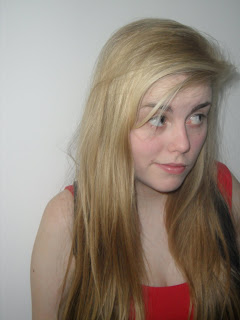
Photos for my Magazine

These are the original photos that I might use in my magazine:


Thursday, 4 March 2010

Magazine Plan

Front Cover and Contents Page:
The image on the front cover.will be a full body shot dominating half the page. The image on the contents page will be used as the background for it.


Analysing Magazine Articles

The artist featured in this NME article is Gerard Way from the rock/punk band My Chemical Romance, which suggests that the target audience are teenagers interested in rock. This band is famous within the under 24’s, which fits in perfectly with the target audience of the magazine – 19 – 24 year olds. The type of language used in the article is a combination of formality and informality. The voice of the interviewer is formal and academic, consisting of phrases such as ‘minor key synths’ and ‘infused victimization’. However this is contrasted with Gerard Way’s colloquial dialogue that appears very genuine and down-to-earth, particularly phrases such as ‘oh my god’ and speech and fillers such as ‘like’. This difference in language would appeal to the audience as it would emphasize the authentic attitude of Gerard Way, allowing them to like him because of the easy understanding. There are parts of the article that hold a humorous tone to engage the reader, such as ‘MCR did very well out of dying’ and ‘more than just pretending to have cancer in stadiums’. This suits the young target group who would continue reading the article. The general tone of the article addresses the reader as an informed intelligent fan; they should be informed to understand the comical references to previous MCR songs such as ‘cancer’ and ‘black parade’, they should be intelligent to understand the intellectual wording and must have an interest in the band or Gerard himself to even read the article. The article consists of many quotations by Gerard way that work often as titles. The text is clear to read, not bold, but still contrasted from the white background. The colours of black and green are clear to read. Black represents the music-style of the artist as well of the magazine, and the green often represents a colour of jealousy, so the magazine might be suggesting that Gerard’s music success is to be envied. The text for the titles is arranged in a slanting position, which could be a slight hint at the rebellious nature of MCR or a different approach to rock music, which in their case is for their music to be ’real’. The actual article information is arranged in columns to add a sense of formality to it and abide by the unspoken rules of layout for magazines. The interview is not a traditional “interviewer speaks, Gerard speaks, etc” format; instead it is a mash-up of different quotations and information from the artist, as well as the editors input of historical information to make it a combination of an interview, historical article and informative text. The whole article consists of four pages, only one of which is dominated by a picture. The rest of the article is primarily text-based, with a few pictures to engage the audience further. This is a reflection on the target audience who would be interested in rock and would want to know more information about it rather than simply look at pictures. NME often includes a poster of the main artist, therefore not many dominating pictures are necessary in the article. The main image is a mid-shot of Gerard Way; it is in direct form of address with the reader which is evident from the strong eye-contact. His shadowy appearance reflects the image on the front cover of the magazine, however this contact is a stern one; perhaps to show his uneasiness with the world or detachment from society – this engages the reader to want to find out more about him. The clothes he wears are the same as on the front, this ensures that the reader recognizes him as the lead artist of this issue. The caption going with the image is ‘this record is going to be the grand failure if people don’t get it.’ This shows that to Gerard, success and money isn’t as important to the understanding and connection with his music. The house style established on the front cover is developed across all the pages I have analysed, not necessarily in colour, but in the text, layout and design. It is also evident that the article requires prior knowledge such as MCR’s previous songs such as ‘cancer’ and the ‘black parade’. The article however does not exclude any readers that are not aware of this, it simply provides more interest and engagement for readers with prior knowledge.


The artist featured in this article of Q magazine is a solo artist Cheryl Cole, who has taken the world by storm in the past few years and is a central icon in the music industry today. This choice of artist would usually suggest a target audience of young males because of her sex appeal and those interested in mainstream music; but Q magazine has transformed her appearance into one of a ‘rockstar’ to suit the rock audience and detach her from the pop-image the band Girls Aloud had created for her. This article merges both formal and informal language, consisting of easier language phrases such as ‘up-to-speed’ and more complex phrasing such as ‘..eclipses harmonies of credibility’. This will engage both the academic reader and the regular guy on the street. The colloquial phrases that we use in every day life such as “I choked on my tea” and the phrases we hear on TV like “cutting edge” are small ways of connecting the reader with the artist, and consequently the reader and the magazine too. The tone of the magazine is an informed one, communicating with an informed intelligent fan, this is evident when they talk about the previous reputation of Girls Aloud, a group she was formerly in – ‘help steer girls aloud from the nadir of credibility’. The style of text used is clear to read and attention grabbing. The colours are reiterated as red black and white to establish the vixen power she possesses, not only literally on the page, but in the music industry as she has totally dominated that field. There are a lot of ‘C’s scattered around the page; to establish her initials and allow her name alone to dominate the page, which is a subtle reflection of her success in the music industry. The interview is laid out as a collaboration of historical text combined with snips of what she has said which together entices the audience in one entertaining article. The article consists of six pages overall which is a reasonably large amount of the magazine. About half of the article is dominated by images of Cheryl Cole, again to emphasize her great sex appeal and show her in a ‘rockstar’ light. Evidently, her speech and historical background aren’t very ‘rockstar’ and thus to not alienate the regular rock readers, the magazine shows picture of her from the eyes of a rock-magazine reader. However, the even distribution of images and texts portrays the values of the audience; that they are interested in the article, but need to be engaged by pictures too – can’t have one without the other. The main caption for the article dominates an entire page, including phrases like “All hail”, the words alone show the artist’s importance and power over the music world. By giving her such power and so many pages, they are giving her God-like features. The presentation of Cheryl Cole through the images demonstrates the idea that she is creating a new image for herself. Q has taken this ‘new image’ idea and made her into a rockstar; she looks comfortable and still powerful in such a persona which thus reveals an idea that she can formulate any image for herself and abide by it perfectly. This ‘rock’ image and colours of red, white and black are established further after the initial front cover. This builds up to a house style of simplicity and reiteration of the colours red, black and white which together form the rock genre the readers are interested in. The article demands no prior knowledge as it explains her background with Girls Aloud, her new solo career and success with her debut album. This is because she is not an artist the rock-audience would be familiar with and thus more historical background is necessary.