My media product uses a range of typical conventions of magazines, yet challenges and develops some aspects to make my magazine different from the others already available. For example, on the front cover; my title block was in the top left corner, I included a barcode and a central image with anchorage text ‘Lauren Transformed’ and puffs such as the band names around it to reflect the classic conventions of magazines. I also maintained a house style throughout, by using the same font and the same colours – black, white, red and orange. However, to develop the forms of conventions on the front cover; I gave a shadow ‘movement’ effect to the figure of the girl in my central image. I haven’t challenged many conventions of the front cover and have done so primarily inside the magazine, so that a regular reader is not put-off by an alien cover on the shelf. However I chose orange for the background colour on the front cover, because it is unconventional and would attract readers more than a black or white cover would. Therefore, inside I presented my images in non-conventional ways – such as a recurring image in the form of a CD on the contents page and editing on a picture on the fifth page that would not normally be seen in a magazine. This should engage the audience and provide a different magazine, yet still not estrange the readers.
My magazine tries to represent a few particular social groups, mainly the target audience. It aims to represent females positively between the ages of 15 -24 that live in the UK and are not as wealthy as readers of more expensive music magazines. This sense of representation is portrayed by my feature article – a successful young girl from the UK that could be a form of inspiration for my readers. Consequently, my targeting younger, poorer females I am challenging conventions of other magazines as they are mostly targeted at males. I have tried to use my feature article and contents page to welcome the reader, create a sense of belonging and a reader/writer relationship. I tried to convey this by the use of colloquial words I used in the article, such as “Lauren flinches at the memory of even being the back-up of such a terrible band”, however I have also showed her in a ‘humble and shy’ manner by not using many images that have a direct mode of address. In terms of uses and gratifications, this sense of belonging to the magazine should entice casual readers to become regular committed readers.
Having previously done research on publishing institutions, I am hoping that "IPC Media" would be the media institution to distribute my magazine, who are known for publishing both niche and mainstream magazines. I have chosen this, because they have previously worked with rock magazines, such as 'NME' and would therefore have experience and knowledge on this matter. It is also relevant to note that over 44% in the UK read an IPCMedia magazine, which opens the door for my magazine to a wider audience as perhaps previous IPCMedia magazine readers would try reading my magazine, 'Fusion.' Furthermore, this publishing company could assist in further plans of making a website or a radio station, like they have with other magazines.
The audience for my magazine are females aged 15 - 24 that live in the UK and have an interest primarily in rock, but with other interest factions in other types of music; perhaps even unheard of bands. I have chosen this target audience because there is a gap in the market for it as there is no other magazine that caters for this type of audience; every rock magazine targets the males, and every female magazine consists of stereotypes of makeup, clothes and gossip. This is also therefore a magazine that goes against typical stereotypes and conventions. I have also decided that as the magazine will be published in larger towns such as London and Liverpool, that I am targeting an ‘average city girl’. However, by having an attractive image on the front cover, males might be interested in this magazine too, and they are also welcome to read the it; most rock magazines do this, particularly ‘Q’.
To attract my target audience, i used a strong black title block that conveyed the 'rock genre' of my magazine, but used red white and orange colours on the front cover to imply that this is a magazine targeted primarily for females; however not suggesting that males cannot read it. The picture I used has an indirect mode of address to not overwhelm the new-readers on the first issue, but as the magazine issues progress, direct contacts should be maintained. I used fonts like "CestGourier" that I found on www.1001fonts.co.uk as it portrays a 'rock theme' and invites regular rock readers. I have also picked a low price for my magazine which is presented clearly on the front cover, as my target audience are not from the richer rungs of society.
Through the process of constructing this project, I have learnt about two key technologies: Photoshop and Blogging. As this was the first time I ever used Photoshop, every basic skill I demonstrated in my production work had been learnt this year; for example feather tools, smudge and blur tools, resizing and moving, fading an image, duplicating images and placing then in front or behind each other for different purposes, how to highlight objects, glow, add shadow, change colour, filter, colour pick and fix the object, how to sharpen images, etc. On Blogger, I learnt the necessary skills on presentation, possibly even to a pedantic nature! It has been a useful tool to gather information, e.g. via creating polls and allowing users to comment on my work, especially my classmates and my teacher; both of whom provided feedback and I was able to assess my work and improve it. I have also learnt how to navigate and access around my work in an efficient manner, i.e. by having a dashboard to manage all my work and edit it all with ease. I have also learnt how to use Adobe Picture Illustrator, and simple tasks of arranging images and inserting text; however, I found Photoshop easier to use and it gave me better results, so I’ve use Photoshop for most of my production work.
Looking back at my preliminary task, I feel that I have learnt a lot in the build-up to the final tasks. For my construction of images, I organised a few photo shoots in different locations, but due to an insufficient camera I had to edit the pictures quite vastly to get good, eye-catching pictures. I changed the shadows/highlights, contrast/light fill, I cropped and resized the images and often made it sepia or black and white(such as on the contents page and on the first page of the main article). To understand the layout conventions, I analysed a few magazine front covers and articles; this helped me to make my own magazine. I realised how important a house style is and spent a while deciding on colours and the layout. Throughout my magazine I used white boxes behind the text to convey the conventionality of magazines, but used different untypical font and images to contradict this. Overall, I have learnt and understood the importance of layout conventions.
I have also found out how to attract an audience – the colours, a bold title block, a captivating central image and a low price. This is particularly relevant to my target audience. I have therefore realised, that doing research and analysis of existing magazines has proved to be helpful in my production work.
Friday, 30 April 2010
Final Magazine Article
Here are the final five pages of my magazine article,once I hadimproved them based on the feedback I received:


Draft Magazine Article
Here are the draft pages of my magazine article.


I have received some feedback to improve each of the pages.
For the first two pages, I will change the colour to red and add white boxes to make the text stand out more. I'm also going to put on a bit less information as I want the first pages to be captivated by her name and image.
For the third and fourth pages, I will change the background to white, put in the legs of the main image and put in the years above both pictures to make it clearer to the reader.
The final page is a bit dry, I will add some more information and try tomake this page a little bit less conventional.
Friday, 23 April 2010
Final Front Cover and Contents Pages
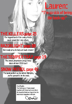
This is the final front cover of my magazine:


This is the final contents page of my magazine:
Monday, 29 March 2010
Draft Designs for Magazine
This is the draft front cover page for my magazine:

How I will improve my cover:
- Feather and brush the uneven surfaces to give it a 'glossy' magazine look
- Fix the person's leg; it is cut off and looks unprofessional
- Fill in the blank space underneath 'Razorlight' .
This is the draft contents page for my magazine:
How I will improve my contents page:
- Add some images to accompany the feature article contents
- Add a page number to direct to the main 'Lauren' article.
- Include access to other factions of the magazine, i.e. 'upcoming events'
4-Page Magazine Article
With the sudden downfall of ‘In Before You’, a band who have scarred the country with it’s disastrous songs, Lauren Zane thought this was the end of her career. But boy, was she wrong.
As a back-up singer, she did not have a major role in this so called ‘best band of 2007’ (an award granted by NME awards); it was something that she hated doing. But a catastrophic turn by the band from ‘electric’ to ‘punk’ music in 2009, turned the public against the band, who have now shamefully disappeared out of the music industry. Lauren flinches at the memory of even being the back-up of such a terrible band.
‘I used to hate being the back-up, clicking my fingers and shuffling my feet, but once things started going wrong, it made it easy to detach myself from it all.’ She was spotted by Columbian Records in early 2009, who have helped her change her appearance to alienate her from the emo/punk image that ‘In Before You’ had previously created. She shivers at a photo of her back then, and is more than willing to talk about her future rather than her past.
Today, Lauren sits comfortably on a couch in the studio, in casual high-street clothes, chatting and laughing to the people around her. Who would have thought this back-up singer would be at the top of the music world?
‘I was in numb shock when I was offered a contract with Columbian Records! I had been working on a few songs myself, and with the help of some of the writers I had a complete album.’ She still seems dumbstruck at this prospect. Columbian Records, who have also launched the albums of Kings of Leon and Kesha, have influenced Lauren’s debut album. Released only 8 months ago, it has won a Brit award and an NME music award. ‘I just couldn’t believe it when they said my name up there. I had practiced speeches since I was five in front of mirrors, but I totally f***** it up on the night with my stutters, it was so shocking!’
This nineteen year-old star has smashed the tables with her single ‘Kiss My Brain’, that has won an MTV video music award, a ‘Q’ award and reached out as far as a Grammy. Lauren’s shelves must be loaded with trophies and medals, and all from a solo career over the 12 months?
The British public have welcomed Lauren with open arms and nominated her as best female artist at the Brit awards. ‘I wasn’t expecting for the public to like me at all, I don’t even like myself!’ She may not expect people to like her, but she can’t deny people loving her music.
As a child, she put her heart into music and drama lessons, not concerned with future financial issues, only following her passion of singing. Gaining a spot in ‘In Before You’ thanks to her college bestfriend Frank Stanley (who also happenned to be the lead singer) was what she believed to be, the start of a successful music career. But with rivalry from The Temper Trap and Kings of Leon, a small band with unsuccessful punk songs that wasonly famous for a short period of time, is not destined to go far.
Being a professional singer - if the awards don’t speak for themselves, let Lauren's grade 8 singing diploma and life-long experience prove otherwise. ‘I have loved singing since I was in the womb, I swear.’ Lauren carries a warm aura around her, captivating not only the staff here, but the public too. If her talent isn’t convincing enough, her great social life, volunteer work and hilarious persona are bound to change that. Her appearance on ‘Mock the Week’ has impressed the country, and she has even been asked to appear as a regular on the show. ‘That has definitely been the highlight of 2010 so far, it’s one of my favourite TV programmes!’
When asked about the future, Lauren proudly lists a bunch of gig performances, TV appearances and ends by revealing her live tour that will launch in October 2010. ‘It’s all happening so fast, everything and everyone seems to be moving around me and I’m just here with my tea. I mean, if you told me a year ago this was going to happen, I would have laughed in your face.’
2009; a turning point for Lauren Zane. The destruction of the failing band ‘In Before You’ and unexpected launch of a fantastic solo career.
Friday, 26 March 2010
Edited Photos
This is the edited photo for the front cover of my magazine:


Edited image for my contents page:
Subscribe to:
Comments (Atom)
