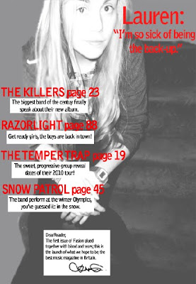
My media product uses a range of typical conventions of magazines, yet challenges and develops some aspects to make my magazine different from the others already available. For example, on the front cover; my title block was in the top left corner, I included a barcode and a central image with anchorage text ‘Lauren Transformed’ and puffs such as the band names around it to reflect the classic conventions of magazines. I also maintained a house style throughout, by using the same font and the same colours – black, white, red and orange. However, to develop the forms of conventions on the front cover; I gave a shadow ‘movement’ effect to the figure of the girl in my central image. I haven’t challenged many conventions of the front cover and have done so primarily inside the magazine, so that a regular reader is not put-off by an alien cover on the shelf. However I chose orange for the background colour on the front cover, because it is unconventional and would attract readers more than a black or white cover would. Therefore, inside I presented my images in non-conventional ways – such as a recurring image in the form of a CD on the contents page and editing on a picture on the fifth page that would not normally be seen in a magazine. This should engage the audience and provide a different magazine, yet still not estrange the readers.
My magazine tries to represent a few particular social groups, mainly the target audience. It aims to represent females positively between the ages of 15 -24 that live in the UK and are not as wealthy as readers of more expensive music magazines. This sense of representation is portrayed by my feature article – a successful young girl from the UK that could be a form of inspiration for my readers. Consequently, my targeting younger, poorer females I am challenging conventions of other magazines as they are mostly targeted at males. I have tried to use my feature article and contents page to welcome the reader, create a sense of belonging and a reader/writer relationship. I tried to convey this by the use of colloquial words I used in the article, such as “Lauren flinches at the memory of even being the back-up of such a terrible band”, however I have also showed her in a ‘humble and shy’ manner by not using many images that have a direct mode of address. In terms of uses and gratifications, this sense of belonging to the magazine should entice casual readers to become regular committed readers.
Having previously done research on publishing institutions, I am hoping that "IPC Media" would be the media institution to distribute my magazine, who are known for publishing both niche and mainstream magazines. I have chosen this, because they have previously worked with rock magazines, such as 'NME' and would therefore have experience and knowledge on this matter. It is also relevant to note that over 44% in the UK read an IPCMedia magazine, which opens the door for my magazine to a wider audience as perhaps previous IPCMedia magazine readers would try reading my magazine, 'Fusion.' Furthermore, this publishing company could assist in further plans of making a website or a radio station, like they have with other magazines.
The audience for my magazine are females aged 15 - 24 that live in the UK and have an interest primarily in rock, but with other interest factions in other types of music; perhaps even unheard of bands. I have chosen this target audience because there is a gap in the market for it as there is no other magazine that caters for this type of audience; every rock magazine targets the males, and every female magazine consists of stereotypes of makeup, clothes and gossip. This is also therefore a magazine that goes against typical stereotypes and conventions. I have also decided that as the magazine will be published in larger towns such as London and Liverpool, that I am targeting an ‘average city girl’. However, by having an attractive image on the front cover, males might be interested in this magazine too, and they are also welcome to read the it; most rock magazines do this, particularly ‘Q’.
To attract my target audience, i used a strong black title block that conveyed the 'rock genre' of my magazine, but used red white and orange colours on the front cover to imply that this is a magazine targeted primarily for females; however not suggesting that males cannot read it. The picture I used has an indirect mode of address to not overwhelm the new-readers on the first issue, but as the magazine issues progress, direct contacts should be maintained. I used fonts like "CestGourier" that I found on www.1001fonts.co.uk as it portrays a 'rock theme' and invites regular rock readers. I have also picked a low price for my magazine which is presented clearly on the front cover, as my target audience are not from the richer rungs of society.
Through the process of constructing this project, I have learnt about two key technologies: Photoshop and Blogging. As this was the first time I ever used Photoshop, every basic skill I demonstrated in my production work had been learnt this year; for example feather tools, smudge and blur tools, resizing and moving, fading an image, duplicating images and placing then in front or behind each other for different purposes, how to highlight objects, glow, add shadow, change colour, filter, colour pick and fix the object, how to sharpen images, etc. On Blogger, I learnt the necessary skills on presentation, possibly even to a pedantic nature! It has been a useful tool to gather information, e.g. via creating polls and allowing users to comment on my work, especially my classmates and my teacher; both of whom provided feedback and I was able to assess my work and improve it. I have also learnt how to navigate and access around my work in an efficient manner, i.e. by having a dashboard to manage all my work and edit it all with ease. I have also learnt how to use Adobe Picture Illustrator, and simple tasks of arranging images and inserting text; however, I found Photoshop easier to use and it gave me better results, so I’ve use Photoshop for most of my production work.
Looking back at my preliminary task, I feel that I have learnt a lot in the build-up to the final tasks. For my construction of images, I organised a few photo shoots in different locations, but due to an insufficient camera I had to edit the pictures quite vastly to get good, eye-catching pictures. I changed the shadows/highlights, contrast/light fill, I cropped and resized the images and often made it sepia or black and white(such as on the contents page and on the first page of the main article). To understand the layout conventions, I analysed a few magazine front covers and articles; this helped me to make my own magazine. I realised how important a house style is and spent a while deciding on colours and the layout. Throughout my magazine I used white boxes behind the text to convey the conventionality of magazines, but used different untypical font and images to contradict this. Overall, I have learnt and understood the importance of layout conventions.
I have also found out how to attract an audience – the colours, a bold title block, a captivating central image and a low price. This is particularly relevant to my target audience. I have therefore realised, that doing research and analysis of existing magazines has proved to be helpful in my production work.
Friday, 30 April 2010
Final Magazine Article
Here are the final five pages of my magazine article,once I hadimproved them based on the feedback I received:


Draft Magazine Article
Here are the draft pages of my magazine article.


I have received some feedback to improve each of the pages.
For the first two pages, I will change the colour to red and add white boxes to make the text stand out more. I'm also going to put on a bit less information as I want the first pages to be captivated by her name and image.
For the third and fourth pages, I will change the background to white, put in the legs of the main image and put in the years above both pictures to make it clearer to the reader.
The final page is a bit dry, I will add some more information and try tomake this page a little bit less conventional.
Friday, 23 April 2010
Final Front Cover and Contents Pages
This is the final front cover of my magazine:


This is the final contents page of my magazine:
Monday, 29 March 2010
Draft Designs for Magazine
This is the draft front cover page for my magazine:

How I will improve my cover:
- Feather and brush the uneven surfaces to give it a 'glossy' magazine look
- Fix the person's leg; it is cut off and looks unprofessional
- Fill in the blank space underneath 'Razorlight' .
This is the draft contents page for my magazine:
How I will improve my contents page:
- Add some images to accompany the feature article contents
- Add a page number to direct to the main 'Lauren' article.
- Include access to other factions of the magazine, i.e. 'upcoming events'
4-Page Magazine Article
With the sudden downfall of ‘In Before You’, a band who have scarred the country with it’s disastrous songs, Lauren Zane thought this was the end of her career. But boy, was she wrong.
As a back-up singer, she did not have a major role in this so called ‘best band of 2007’ (an award granted by NME awards); it was something that she hated doing. But a catastrophic turn by the band from ‘electric’ to ‘punk’ music in 2009, turned the public against the band, who have now shamefully disappeared out of the music industry. Lauren flinches at the memory of even being the back-up of such a terrible band.
‘I used to hate being the back-up, clicking my fingers and shuffling my feet, but once things started going wrong, it made it easy to detach myself from it all.’ She was spotted by Columbian Records in early 2009, who have helped her change her appearance to alienate her from the emo/punk image that ‘In Before You’ had previously created. She shivers at a photo of her back then, and is more than willing to talk about her future rather than her past.
Today, Lauren sits comfortably on a couch in the studio, in casual high-street clothes, chatting and laughing to the people around her. Who would have thought this back-up singer would be at the top of the music world?
‘I was in numb shock when I was offered a contract with Columbian Records! I had been working on a few songs myself, and with the help of some of the writers I had a complete album.’ She still seems dumbstruck at this prospect. Columbian Records, who have also launched the albums of Kings of Leon and Kesha, have influenced Lauren’s debut album. Released only 8 months ago, it has won a Brit award and an NME music award. ‘I just couldn’t believe it when they said my name up there. I had practiced speeches since I was five in front of mirrors, but I totally f***** it up on the night with my stutters, it was so shocking!’
This nineteen year-old star has smashed the tables with her single ‘Kiss My Brain’, that has won an MTV video music award, a ‘Q’ award and reached out as far as a Grammy. Lauren’s shelves must be loaded with trophies and medals, and all from a solo career over the 12 months?
The British public have welcomed Lauren with open arms and nominated her as best female artist at the Brit awards. ‘I wasn’t expecting for the public to like me at all, I don’t even like myself!’ She may not expect people to like her, but she can’t deny people loving her music.
As a child, she put her heart into music and drama lessons, not concerned with future financial issues, only following her passion of singing. Gaining a spot in ‘In Before You’ thanks to her college bestfriend Frank Stanley (who also happenned to be the lead singer) was what she believed to be, the start of a successful music career. But with rivalry from The Temper Trap and Kings of Leon, a small band with unsuccessful punk songs that wasonly famous for a short period of time, is not destined to go far.
Being a professional singer - if the awards don’t speak for themselves, let Lauren's grade 8 singing diploma and life-long experience prove otherwise. ‘I have loved singing since I was in the womb, I swear.’ Lauren carries a warm aura around her, captivating not only the staff here, but the public too. If her talent isn’t convincing enough, her great social life, volunteer work and hilarious persona are bound to change that. Her appearance on ‘Mock the Week’ has impressed the country, and she has even been asked to appear as a regular on the show. ‘That has definitely been the highlight of 2010 so far, it’s one of my favourite TV programmes!’
When asked about the future, Lauren proudly lists a bunch of gig performances, TV appearances and ends by revealing her live tour that will launch in October 2010. ‘It’s all happening so fast, everything and everyone seems to be moving around me and I’m just here with my tea. I mean, if you told me a year ago this was going to happen, I would have laughed in your face.’
2009; a turning point for Lauren Zane. The destruction of the failing band ‘In Before You’ and unexpected launch of a fantastic solo career.
Friday, 26 March 2010
Edited Photos
This is the edited photo for the front cover of my magazine:


Edited image for my contents page:
Thursday, 25 March 2010


Thursday, 4 March 2010
Magazine Plan


Analysing Magazine Articles
 The artist featured in this NME article is Gerard Way from the rock/punk band My Chemical Romance, which suggests that the target audience are teenagers interested in rock. This band is famous within the under 24’s, which fits in perfectly with the target audience of the magazine – 19 – 24 year olds. The type of language used in the article is a combination of formality and informality. The voice of the interviewer is formal and academic, consisting of phrases such as ‘minor key synths’ and ‘infused victimization’. However this is contrasted with Gerard Way’s colloquial dialogue that appears very genuine and down-to-earth, particularly phrases such as ‘oh my god’ and speech and fillers such as ‘like’. This difference in language would appeal to the audience as it would emphasize the authentic attitude of Gerard Way, allowing them to like him because of the easy understanding. There are parts of the article that hold a humorous tone to engage the reader, such as ‘MCR did very well out of dying’ and ‘more than just pretending to have cancer in stadiums’. This suits the young target group who would continue reading the article. The general tone of the article addresses the reader as an informed intelligent fan; they should
  be informed to understand the comical references to previous MCR songs such as ‘cancer’ and ‘black parade’, they should be intelligent to understand the intellectual wording and must have an interest in the band or Gerard himself to even read the article. The article consists of many quotations by Gerard way that work often as titles. The text is clear to read, not bold, but still contrasted from the white background. The colours of black and green are clear to read. Black represents the music-style of the artist as well of the magazine, and the green often represents a colour of jealousy, so the magazine might be suggesting that Gerard’s music success is to be envied. The text for the titles is arranged in a slanting position, which could be a slight hint at the rebellious nature of MCR or a different approach to rock music, which in their case is for their music to be ’real’. The actual article information is arranged in columns to add a sense of formality to it and abide by the unspoken rules of layout for magazines. The interview is not a traditional “interviewer speaks, Gerard speaks, etc” format; instead it is a mash-up of different quotations and information from the artist, as well as the editors input of historical information to make it a combination of an interview, historical article and informative text. The whole article consists of four pages, only one of which is dominated by a picture. The rest of the article is primarily text-based, with a few pictures to engage the audience further. This is a reflection on the target audience who would be interested in rock and would want to know more information about it rather than simply look at pictures. NME often includes a poster of the main artist, therefore not many dominating pictures are necessary in the article. The main image is a mid-shot of Gerard Way; it is in direct form of address with the reader which is evident from the strong eye-contact. His shadowy appearance reflects the image on the front cover of the magazine, however this contact is a stern one; perhaps to show his uneasiness with the world or detachment from society – this engages the reader to want to find out more about him. The clothes he wears are the same as on the front, this ensures that the reader recognizes him as the lead artist of this issue. The caption going with the image is ‘this record is going to be the grand failure if people don’t get it.’ This shows that to Gerard, success and money isn’t as important to the understanding and connection with his music. The house style established on the front cover is developed across all the pages I have analysed, not necessarily in colour, but in the text, layout and design. It is also evident that the article requires prior knowledge such as MCR’s previous songs such as ‘cancer’ and the ‘black parade’. The article however does not exclude any readers that are not aware of this, it simply provides more interest and engagement for readers with prior knowledge.
 The artist featured in this article of Q magazine is a solo artist Cheryl Cole, who has taken the world by storm in the past few years and is a central icon in the music industry today. This choice of artist would usually suggest a target audience of young males because of her sex appeal and those interested in mainstream music; but Q magazine has transformed her appearance into one of a ‘rockstar’ to suit the rock audience and detach her from the pop-image the band Girls Aloud had created for her. This article merges both formal and informal language, consisting of easier language phrases such as ‘up-to-speed’ and more complex phrasing such as ‘..eclipses harmonies of credibility’. This will engage both the academic reader and the regular guy on the street. The colloquial phrases that we use in every day life such as “I choked on my tea” and the phrases we hear on TV like “cutting edge” are small ways of connecting the reader with the artist, and consequently the reader and the magazine too. The tone of the magazine is an informed one, communicating with an informed intelligent fan, this is evident when they talk about the previous reputation of Girls Aloud, a group she was formerly in
  – ‘help steer girls aloud from the nadir of credibility’. The style of text used is clear to read and attention grabbing. The colours are reiterated as red black and white to establish the vixen power she possesses, not only literally on the page, but in the music industry as she has totally dominated that field. There are a lot of ‘C’s scattered around the page; to establish her initials and allow her name alone to dominate the page, which is a subtle reflection of her success in the music industry. The interview is laid out as a collaboration of historical text combined with snips of what she has said which together entices the audience in one entertaining article. The article consists of six pages overall which is a reasonably large amount of the magazine. About half of the article is dominated by images of Cheryl Cole, again to emphasize her great sex appeal and show her in a ‘rockstar’ light. Evidently, her speech and historical background aren’t very ‘rockstar’ and thus to not alienate the regular rock readers, the magazine shows picture of her from the eyes of a rock-magazine reader. However, the even distribution of images and texts portrays the values of the audience; that they are interested in the article, but need to be engaged by pictures too – can’t have one without the other. The main caption for the article dominates an entire page, including phrases like “All hail”, the words alone show the artist’s importance and power over the music world. By giving her such power and so many pages, they are giving her God-like features. The presentation of Cheryl Cole through the images demonstrates the idea that she is creating a new image for herself. Q has taken this ‘new image’ idea and made her into a rockstar; she looks comfortable and still powerful in such a persona which thus reveals an idea that she can formulate any image for herself and abide by it perfectly. This ‘rock’ image and colours of red, white and black are established further after the initial front cover. This builds up to a house style of simplicity and reiteration of the colours red, black and white which together form the rock genre the readers are interested in. The article demands no prior knowledge as it explains her background with Girls Aloud, her new solo career and success with her debut album. This is because she is not an artist the rock-audience would be familiar with and thus more historical background is necessary.
Friday, 26 February 2010
My Title Block
Here are three potential title blocks that I may use for my magazine. Please choose the best one and vote on the left hand-side:
 2. POPEAR
 3. FUSION
 I have decided to use number 3 as my title block and thus to call my magazine 'Fusion' as fusion literally means 'a coalition, production of a union', so in relation to my magazine, it is a 'coalition of different types of music', but is still primarily rock.
1. ZILCH
2. POPEAR 3. FUSIONI have decided to use number 3 as my title block and thus to call my magazine 'Fusion' as fusion literally means 'a coalition, production of a union', so in relation to my magazine, it is a 'coalition of different types of music', but is still primarily rock.The colours I have chosen to use for my title blocks areblack and shades of pink. Black to emphasize the rock genre of the magazine and pink to reflect the target audience. However, I have selected to use Fusion which is a sold, easy easy to read, black title block which will stand out effectively against any colour background I choose to use.
Sunday, 7 February 2010
Contents Page Analysis

The contents page for NME magazine is dominated by a single image of a band called Blur, who have reunited here for a London premier. Their body language suggests comfortability and friendliness towards each other and ergo towards the consumer. In contrary, their mode of indirect address implies a less forward and more chilled relationship with the reader. This suits the target audience of 16 - 24 year old males as they would relate to the comfortability and laid back attititude. The fact that the main focus on this music group is not the music side of it but a 'movie' aspect, it relates to the rebellious, unstereotypical ethos of the magazine. The only other image is a small picture of a January issue of NME, simply to pomote themselves so the readers continue buying NME.
The colours used are black, red and white, which together create a very stylish effect. These colours match the colours on the front cover and thus a house style is being developed. The fonts used are the plain and easy-to-read like on the cover, again to avoid messiness and keep the house style.
The contents information is on the far left, allowing room for a poweul story to capture readers' attention. This makes it seem like the actual stories and interviews are more important to the magazine than a guide on how to access the magazine. The actual contents are organised in an alphabetical sorting, unlike other magazines that simply follow a chronological order. This makes is easier to find the artists readers are interested in, making the magazine very simple to navigate.
There is a strip on the bottom of the page that works as a promotional offer; it states that a subscription with NME will allow constant readers to get an issue for 85p, which would appeal to the target audience very much who do not have a large amount of money.
On the top right corner of the contents page, there is a small NME logo. This makes the magazine appear to be humble as they are less important than the dominating Blur article. Plus, as the readers have opened up an NME magazine, they would be aware of which magazine they are reading and a dominating NME logo is not necessary inside, whereas on the front cover a consistant dominating title would make more sense.
Friday, 5 February 2010
Questionnaire Result Analysis
The results of my questionnaire have provided me with information of the interests and wants of my target audience. I was able to decide on the magazine name, price and features based on these results, which are displayed below in pie charts.

 The magazine will be published once a month, which will give me time to create the in-depth articles and gather the information for the articles featured.
 Evidently, a free CD would attract consumers the most effectively, though posters would be a cheaper means and still very attractive; therefore posters would be a more suitable option for me.
 Interviews appear to be the most preferred feature, so that will be the main focus of the magazine. Though I will also include artist history and in-depth articles to maintain a balance.

 Clearly, my target group want the magazine to feature somenon-famous artists so that they learn about new artists they wouldn't have had access to before.


My target audience would be willing to pay £2 on average for the magazine. This is a suitable price as it could potentially create a profit and is still affordable for the public.
 The magazine will be published once a month, which will give me time to create the in-depth articles and gather the information for the articles featured.Evidently, a free CD would attract consumers the most effectively, though posters would be a cheaper means and still very attractive; therefore posters would be a more suitable option for me.Interviews appear to be the most preferred feature, so that will be the main focus of the magazine. Though I will also include artist history and in-depth articles to maintain a balance.
Clearly, a mixture of both band and single solo artist articles are the desired option by my target audience. This would make my magazine more diverse and attract a variety of customers.
Clearly, my target group want the magazine to feature somenon-famous artists so that they learn about new artists they wouldn't have had access to before..
.
Questions 8 and 9 have proved that 50% of my target audience currently read a magazine, meaning that I have a remaining 50% to intrigue into the world ofmusic magazines as well as the half of music-magazine readers to read my magazine too. The most commonly read magazine within this target audience are NME and Q which impies the a magazine that should influence my production decisions.

The magazine name is either going to be 'Fusion' or 'RockEar', both of which are approved by the target audience.
Proposal and Questionnaire
PROPOSAL
The genre I have chosen for my music magazine is rock, but with features of infamous artists. Rock is a demanding genre that has a vast audience that are easy to appeal to. The target audience I have chosen are 16 – 24 year old females; this magazine is needed in the market as there are no rock magazines for females even though the potential audience for it is huge.
QUESTIONNAIRE
1. How much do you think the magazine should cost?
Under £1 [ ] £1 to £1.99 [ ] £2 to £2.99 [ ] Over £3 [ ]
2. How frequently should the magazine be published?
Weekly [ ] Fortnightly [ ] Monthly [ ]
3. Which of the following would attract you more to a magazine?
‘Freebies’ [ ] Posters [ ] a free CD [ ]
4. Which of these would you prefer the magazine to consist of?
In-depth articles [ ] Interviews [ ] artist history [ ]
5. Would you want the magazine to feature mostly bands or single artists?
Band [ ] Single artists [ ] Equal mixture of both [ ]
6. Would you like non-famous artists to be featured?
Yes [ ] No [ ]
7. Do you currently read a music magazine?
Yes [ ] No [ ]
8. If yes, what magazine?
_________________________________
9. Which of the following do you think is the best name for this magazine?
Fusion [ ] Zilch [ ] RockEar [ ]
Monday, 1 February 2010


Friday, 29 January 2010


Thursday, 28 January 2010
Analysing Block Titles

- The target audience for Kerrang! are 15 – 24 year old males, although it falls under the category of 15 – 44 year olds. Their block title aims at this audience by the use of structure, colour, context and denotations.
- The actual word Kerrang! is the onomatopoeic sound for a violent guitar string strum that implies the genre of the magazine; rock music.
- This is emphasized further by the shattered glass effect within the word that shows how violent the strum was, as it caused glass to break. This gives a sense of distortion and aggression.
- The font is capitalized and ends in an exclamation mark to attract the younger audience by its boldness. The rebellious feature of the coloured in ‘A’ is an anarchical way of going against the conventions of the alphabet; a symbol of their rebellious target audience.
- The black colour also reveals the genre and target audience of Kerrang! to be rock-engaged, stereotyped ‘emos’. This is heightened by the rough edges that could symbolise an audience that have rough lives.

- The target audience for NME are similar to that of Kerrang! – 15 – 24 year old males; their block title aims at this audience by the use of structure, colour, context and the denotations.
- NME stands for ‘New Musical Express’ which clearly denotes the aim of their magazine; to reveal new artists and genres to the world; a journey of discovery.
- NME sounds like ‘enemy’ which reflects a rebellious newspaper; even though now it is more glossy than it used to be.
- The colours are black, red and white that contrast greatly from one another – this symbolises the contrast of all the ‘new’ music the magazine covers. The colours are bold and attract the youth who ant to differ from the older generation and thus have new music, new style etc.
- The letters are capitalized; again to attract the appropriate target audience by its boldness. It is emphasized by a perfectly straight outline to express power, accuracy and stability; emphasized by the pointy ‘M’ centre. This could give the magazine a ‘cutting edge’ to attract the younger generation.
- The ‘heat magazine’ of the music world.

- The target audience for ‘MOJO’ are24 – 44 year old males. It falls into the same 15 – 44 year old category as the previous two, however this magazine appeals more to the older part of this target audience. The style, colours and context appeal to this audience.
- MOJO is often used to mean sex appeal, but in this case for a music magazine it means ‘talent’. It is associated with the 70’s, so the 24 – 44 year olds so those that favour this time period would enjoy this magazine. This shows that the genre of their magazine is very broad, concerned only with the best of the music world.
- The black and white theme symbolises the formality of the magazine, aiming at the older of the 15 – 44 year olds. Black and white are concrete colours that have always been in fashion, always used in everything and reflect upon power.
- The writing is simplistic and would not appeal to the ‘hip’ young generation. The font also has a shadow effect to reflect a night life or perhaps a reminiscing-the-old-days effect. Either way, it appeals to the target audience.
- MOJO is an old magazine, sticking to the conventions of the 70’s, which again heightens the word mojo itself having originated from that time period. This demonstrates the target audience to be older themselves.

- The target audience of ‘Q’ are 24 – 44 year old men. It aims at them by the use of colour and style of the block title.
- Much of the magazine is devoted to interviews with popular music artists and are well known for compiling lists; the letter ’Q’ reminds me of queues which reflect lists – a small denotation of the title in relation to the role of the magazine.
- The colours of red and white symbolise power, perhaps a sexual appeal. The red symbolises an alertness, an important warning, which is soothed by the peaceful white ‘Q’.
- It is aimed at the British audience so the colours that reflect their flag -white and red would be appealing to the British citizen.
- The fact that it is a one letter magazine shows the power and prominence of the newsstands.
- The letter ‘Q’ is not perfectly straight, it is slightly tilting to the left; this is visible by the red centre circle. This shows the ‘quirky’ side to the magazine, that is is not what expected. As well as covering the classic rock, it covers the left-field acts, hence the tilt to the left.
- The small shadow is used to show that it is following ’Q’ magazine, just like the target audience are as it is a top-notch magazine.
Thursday, 21 January 2010
Analysing Magazine Covers

‘Q’ is a music magazine targeted at 24 – 44 year old British men as much of the magazine is devoted to interviews with popular music artists and serious, in-depth stories. This age group would have interests in a broad serious genre of music, ranging from the White Stripes to 50 Cent and reading deeper articles. We can tell that these interests are met by the magazine because of the puffs that promote articles on a wide range of acts such as Midlake and John Lennon; this tells us that the magazine aims at people that do not concentrate on just one type of music. The puff that that states ‘The 10 Best New Acts’ explains that this first issue of 2010 will predict and promote successes in the following year; it also works as a buzz word as it makes the magazine sound more exciting. This is an effective way to get people to buy the magazine – regular consumers will be attracted to this feature as it consists of new music from a wide range, and new customers who are interested in the upcoming music would also purchase the magazine.
The main article in the magazine is about Cheryl Cole which is advertised by the anchorage text “3 words... Cheryl Cole, Rocks”; this does not reveal a lot about the story but engages the reader as we are interested in this different representation of Cheryl Cole as she is detached from her zone as a Girls Aloud pop star and portrayed as a rockstar. This satirical use of ‘3 words’ which is the name of her new album is a tabloid way of attracting customers. By creating a ‘rock’ image for Cheryl, this appeals to the target audience who are not particularly interested in her regular pop music. There is a direct mode of address as the magazine wants to create a strong direct relationship between it and its readers. This should typically encourage the consumer to purchase the magazine. Cheryl Cole is on the front cover as she has recently released her solo debut album and as a rising star she would be of interest to readers. Considering that the target audience for ‘Q’ is 24 – 44 year old men, it is evident that Cheryl Cole would have sex appeal and entice readers; she was voted number 1 sexiest woman of 2009 in FHM. It is rather unusual to have someone on the cover who is not under the range of ‘serious’ music, but this is justified because she is a star icon at the top of the music world.
The overall message presented by this central image is her sex appeal. This is heightened by her separation from her regular pop image to meet the interests of the target audience. The image reflects the film “Sin City” which is an intertextual reference that the readers would be aware of; this is to make sure that the readers do not feel estranged or alienated. Her her dark, rough make-up and wet hair create a ‘horror’ effect. Combined with the anchorage text it makes it seem like a scary movie advert; again playing on this idea of “Sin City”. The pointy blade ring emphasizes the overall message of her sex appeal as she is licking the tip in a sexual seductive way. Her red lips make her seem like a vixen, which stands out and sexually attracts men to the magazine. To the female readers of the magazine, this could represent feminine power.
This image represents a few stereotypical groups. As mentioned before, is could symbolise the power and rise of females. It could also be used to show that rock images are stronger than the image of pop, as a pop star was transformed into a momentary “rockstar”. The magazine represents this by the vixen colours, direct mode of address and appealing “Sin City” reference.
The title block reveals the target audience and emphasizes the message of the cover; the colours of red and white symbolise power, perhaps a sexual appeal; both features that the central image tries to convey. The red symbolises an alertness, an important warning, which is soothed by the peaceful white ‘Q’. It is aimed at the British audience so the colours that reflect their flag -white and red would be appealing to the British citizen. The fact that it is a one letter magazine shows the power and prominence of the newsstands. The letter ‘Q’ is not perfectly straight, it is slightly tilting to the left; this is visible by the red centre circle. This shows the ‘quirky’ side to the magazine, that is is not what expected. As well as covering the classic rock, it covers the left-field acts, hence the tilt to the left. This fits in perfectly with the image of Cheryl Cole; she is portrayed as edgy and is not what is expected.
There is a slogan-type coverline at the top that claims that ‘Q’ is “The UK’S Biggest Music Magazine”. This helps to attract new readers by basically saying that ‘Q’ is the magazine they should be reading. It also maintains old regular consumers by saying that ‘Q’ is still the best magazine and they should carry on reading it. It tells us that the magazine is prominent on the newsstands and has the ability to dominate the music magazine market.
The colours used for this cover are black, red and white. These are very powerful, dominant and sexual colours that also appeal to the target audience. The red highlights the sex appeal of Cheryl Cole and the black demonstrates her authority. These colours are the primary colours used in horror movies, especially the typical ones like “Scary Movie” and ergo heightens the “Sin City” appeal. This creates an edgy, dark and rather scary atmosphere that makes us idolise Cheryl as she looks so confident and powerful in such a mood.
The fonts used on the anchorage remind me of the fonts used on horror film posters; the framing and positioning of the text is also similar to this, again an intertextual reference to the film. The fonts used are simple and bold that attract the audience and make it easy to read and quickly spottable on the shelves.
‘Q’ magazine does not aim at its audience through ‘freebies’ or posters; it targets them by the exclusive stories and special features that are promoted by the buzz words such as the John Lennon feature and the Best New Acts, etc. Through the use of all the mise-en-scene and denotations, this magazine successfully attracts consumers.

NME, first published in 1952, stands for ‘New Musical Express’ which clearly denotes the aim of their magazine; to reveal new artists and genres to the world; a journey of discovery. The target audience for this ‘heat magazine’ of the world are 15 – 24 year old males. Their block title aims at this audience by the vibrant colours and simple font. NME sounds like ‘enemy’ which reflects a rebellious newspaper and interests their target audience; even though now it is more glossy than it used to be. NME targets two audiences of diverse interest; it established new genres to its readers and it aims at regular readers by its close association with punk/rock music and has adapted such a reputation. Therefore readers with interests in punk/rock and readers with interests in new music would buy this magazine, creating double the profit for the magazine. The puffs scattered all over the magazine establish this “punk” association as the music it talks about is classified as rock/punk or somewhat indie; e.g. Vampire Weekend, My Chemical Romance, etc. This is also an effective way to attract potential buyers.
The main article in the magazine is about a member of the punk band My Chemical Romance which is explained by the anchorage text “MY CHEMICAL ROMANCE, on their punk comeback album”; this anchorage text also mentions the interests of the target audience – PUNK; this would not estrange the regular readers from what they are accustomed. However, NME will also attract customers that have an interest in a broad genre of music as this is a ‘comeback’ of My Chemical Romance and would possibly strive to be popular in the upcoming year. There is a direct mode of address between the reader and the man on the cover as the magazine wants to create a strong relationship between itself and the reader to encourage them to purchase this magazine. However it is evident that this contact is an unfriendly one; perhaps to show his uneasiness with the world or detachment from society; possibly even a malcontent of the music world? He is on the cover because his band are going tor release a ‘comeback album’ that rock fans have been anticipating. The framing of the shot is a long-shot that shows his entire body; this is to show that perhaps he was in motion when the picture was taken to echo the chaos of the music and to emphasize his body language. His left-faced body position could symbolise the left-faced music acts, not just punk and rock; again to subtly entice both punk lovers and new-genre fanatics. His edgy haircut and dark make-up could reflect his character; it makes him appear like a Vampire. This is strengthened by his facial expression and studio lighting. His facial expression is a solemn, mysterious and edgy one that although communicates with the reader, it is still a distant one; like he doesn’t want to let the readers access his personality, which ironically he reveals in the articles. The shadow caused by his hair combined with the dark lighting of the studio shows that there is a hidden part to him that could be released in the new album – this again heightens the aim of the magazine ‘NME’ to revel a new music genres to the world, yet still please the punk/rock audiences. This creates an overall message that his edgy persona will be revealed in the new album and that there’s more to him than just punk. His outfit also hints at the idea of vampires; this costume looks like a common uniform for a time period back in the 1800’s, yet it has been made “cooler” and more fashionable. The colour theme of this cover is black, red and white. These are very dominant and powerful colours that would appeal to the male target audience; they also fit in with the consistent colours of the title block to compose the magazine cover and glue all the factions together using the same colour theme. These colours are often stereotypically associated with rock/punk magazines, as it reflects the personalities of the “emo, rocker, scene” kids .
There are slogan-type cover lines at the top and bottom of the magazine, both of which promote artists featured in the magazine. It is interesting how both cover-lines contain a buzz word each, i.e. “NEW” and “PLUS”; this attracts readers as it makes it seem like there is something in this issue that is exclusive and not found in others, e.g. NME was the first British magazine to include a singles chart, so they could potentially continue to surprise their audiences with new ’inventions’. The fact that the artists featured in these cover-lines are in fact not classified as punk, such as Kid Cudi, allows the magazine to function as the “New Musical Express” that it is by featuring new genres of music.
NME magazine does not aim at its audience through ‘freebies’ or posters; it targets them by the exclusive stories, special features, compiled lists, etc. Through the use of all the mise-en-scene and denotations, this magazine successfully attracts consumers.
Subscribe to:
Comments (Atom)
